Marpidi Website Product Design
Marpidi is a Web and Mobile platform for viewing & making short films and web series. It is a collaborating hub for all directors, technicians, actors and everyone involved with film making. There are many people with immense talent and passion for movie making. Marpidi was born to bring all people that share such passion and provide a chance to showcase their work.
The startup's primary goal was to bring everyone together, share knowledge and help them make
great creative films. Another key goal was to show the appropriate content from these creators
to the audience.
Humans impacted 🏆: 100+ (Product pre-launch numbers)
NOTE: The starup is currently in stealth mode, hence most of the
core business designs are not displayed or detailed.
MY ROLE
User research, product design, information architecture,
visuals, user flows, prototyping,
user testing
MY TOOLS

INTRO ✋
The website product designs are based on a phase two research and analysis. It was done when some of the key initial product offerings from phase-1 have been modified to simplify the features and product to the users. Though the core idea remains the same, there have been some considerable modifications from phase-1(showcased in the mobile section) to phase-2.
FEATURES ⭐
It was important for me to identify the full list of products being offered to categorize them into a subset of features list. As a designer, we should be focused on the customer facing products as well the internal products support being integrated into the website that help run the whole business. The key features being offered can be categorized as below:
- Short Films
- Web Series
- Projects
- Hub
- Productions
- Tools
DESIGN 🌈
As a designer with technical background it has also helped me in understanding where to begin and proceed in the design process. If we consider any simple feature that a user needs to interact with, it will basically go through four or less number of stages through out its life cycle. So a user would need a way to create, view, update and delete content.
Once I identified this, I followed the pattern of first creating the designs for Creating/Adding content to Marpidi. Then followed by adding the ability to Edit/Update the content and then the designs for Viewing the content created. Finally a way to Delete the content added. All these four have to be fitted seamlessly into the whole website's equation without having difficulty navigating. Here is a navigation architecture that displays some of the features.

Short film designs
Below are the designs that display the default view of the short films page, sort-by options design, filter-options view design and selected filters design. My aim was to keep the UI as simple as possible and avoid displaying any unnecessary information to the user.
👈 All Short Films
This page shows all the short films in a default view. At the top you can see the filters and sort-by options. By default we show 16 films and upon scrolling another 16 will be loaded. Lazy-load feature was implemented to help the user where we auto-load the next set of results without the user having to click.
Short Films Sort View 👉
This page shows the sort by options that are available for the user. I picked up the "CLAPS" terminology from the movie world after a practical experience. It seemed quite relevant because a good movie is always appreciated through claps in a theater at the end, so I felt the users would connect more with this term as an appropriate appreciation keyword.
👈 Short Films Filter options
We displayed the right number of filters options with the correct sub-choices after an extensive research of users preferences, likes and dislikes. With the ability to see all filtering options in a single click and select multiple at the same time saves time. In future, some of the filter options that will be displayed can be made dynamic by identifying the user's view and search patterns, so his preferred custom choices show up as filters.
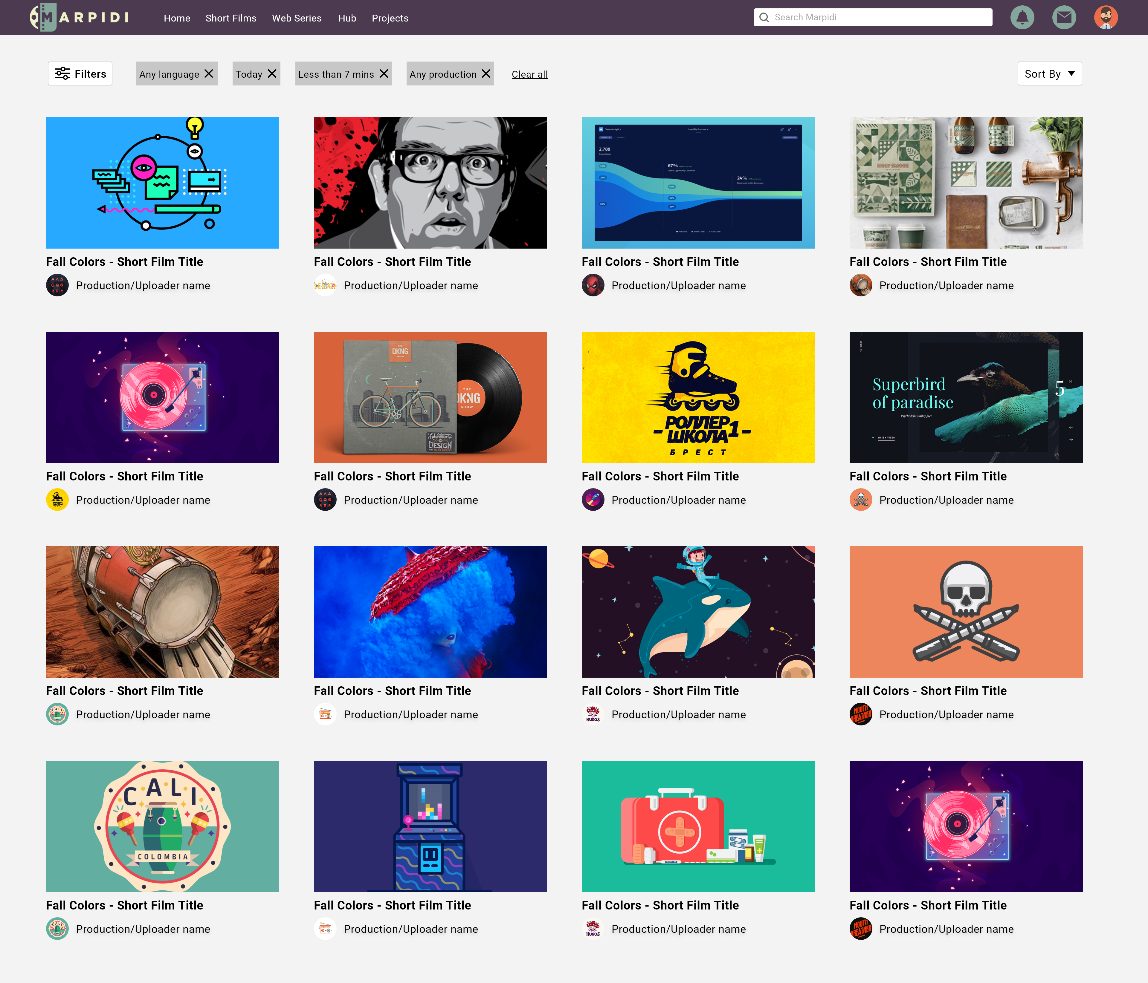
Short Films Filtered Results View 👉
The selected filters will be displayed as individual tags so the user can just delete a certain tag if not needed without having to go to the filters again. Interactions like these make a better user experience.
Web Series designs
Design need to be consistent and show the subtle differences in a good UI. Below are the designs that display the Web Series related pages where you will notice that designing them in this way would help the users as well as the development team where their efforts are also taken into considerations while building a product from scratch.
As you can see below, we showed the episodes number on the thumbnail itself. This saves space outside the thumbnail by avoiding information clutter and also depicts the content difference from a visual perspective upon a glance that the user is looking at a web series rather than a short film.

Production, Project, Hub, Tools & Settings Designs
All these features were designed to solve the business problem keeping user experience in mind. All pages were designed using the same design guide so the look and feel would make the user feel native to the website.
Unfortunately, I cannot share more designs at this point of time due to the start-up being in stealth mode 😅 but I'd love to share them here once the product has been released. So please do visit again in mid 2021 😀.


