My Inventory - Mobile App
My Inventory App is a asset repository of your personal belongings. This application can help document your assets for getting insurance or when you plan to relocate.
MY ROLE
UX/UI, responsive design, contributing for problem solving, user research, user interviews, persona creation, concept based designing, wireframes/prototypes, think-aloud tasks, cognitive walkthrough, heuristic evaluation
MY TOOLS

APPROACH
I have made my efforts to understand the concepts of inventory, insurance requirements, agents and business needs to design better interactions. We started with researching the market needs and the user requirements. Based on the research and user interviews conducted, we identified key areas that needed our attention.
"How often do businesses or insurance companies do/request inventory checks?"
"What are the age groups that are likely to use this product?"
"What key features can be included so that manual work can be reduced?"
"How can we handle data sharing between two parties?"
GOALS
Time Saver
Provide a quick way of entering information rather than entering them manually thus saving immense amount of work hours.
Sharing Inventory
Design an interaction such that sharing the inventory will be a seamless experience.
Organized Structure
Folder structure needs to be designed such that it can be accessed with minimal interactions.
USER INTERVIEW SCENARIOS
Keeping the concept of the application in mind, we dived-in to know more about the features involved for the product from the user side. To find this out, we have conducted some user interviews, where we have considered few participants like home owners who were subject to a robbery, users who are looking to download a home inventory application and business owner.
In a situation where you document your possessions to inform your insurance company that you own the item
- How do you document them? If this is not a common occurrence, how would you go about documenting possessions.
- What tools do you use to capture the possession?
- Do you follow a process for capturing your possessions and organizing them?
- How do you review your collection of items?
- How do you browse for your collection of items?
- If you had to edit or update your collection, how would you do it?
A few questions regarding your preferences of a potential tool:
- Would you prefer to use the tool as a web application or as a mobile app or both?
- For sharing purposes, which format you would like to choose - .pdf or .csv or .doc or all of them?
- What do you think is the smart way to document items?
- For yourself
- For Family and significant others
- For third party clients that need access to your collection (insurance companies potential buyers of the items)
Think that you are moving to a new home which is a long-distance city or a state:
- Do you have a detailed inventory of your possessions?
- Do you use any tool or application to identify anything that goes missing once you have unpacked your things?
- Do you safeguard the copy of your possessions?
Now to go more specific into the topic, think about your home for a moment and imagine that your home was robbed last night:
- Can you accurately list everything that is no longer there?
- Would you be able to recall the contents inside the drawer, closet?
- Do you have all those receipts that you need to submit for insurance?
- Would you be able to document all your processions at home along with their model/serial numbers, actual price, quantity and brand?
FEATURES 👑
After doing the research and understanding the needs of our user base, we started the journey by building the designs in a iterative process which provided a solution that was both meaningful and satisfied the needs. Below are some low-fidelity designs for some of the key features.
For "The Old Hand"
Sharing Inventory
Sharing the inventory is a quick 2-click process. Providing the share option for each folder or sub-folder gives more freedom the users in sharing specific things. They can categorize the folders such that all shared items can be named under a certain folder.
Swipe -> More -> ShareFor "The Newbie"
Categorizing Inventory
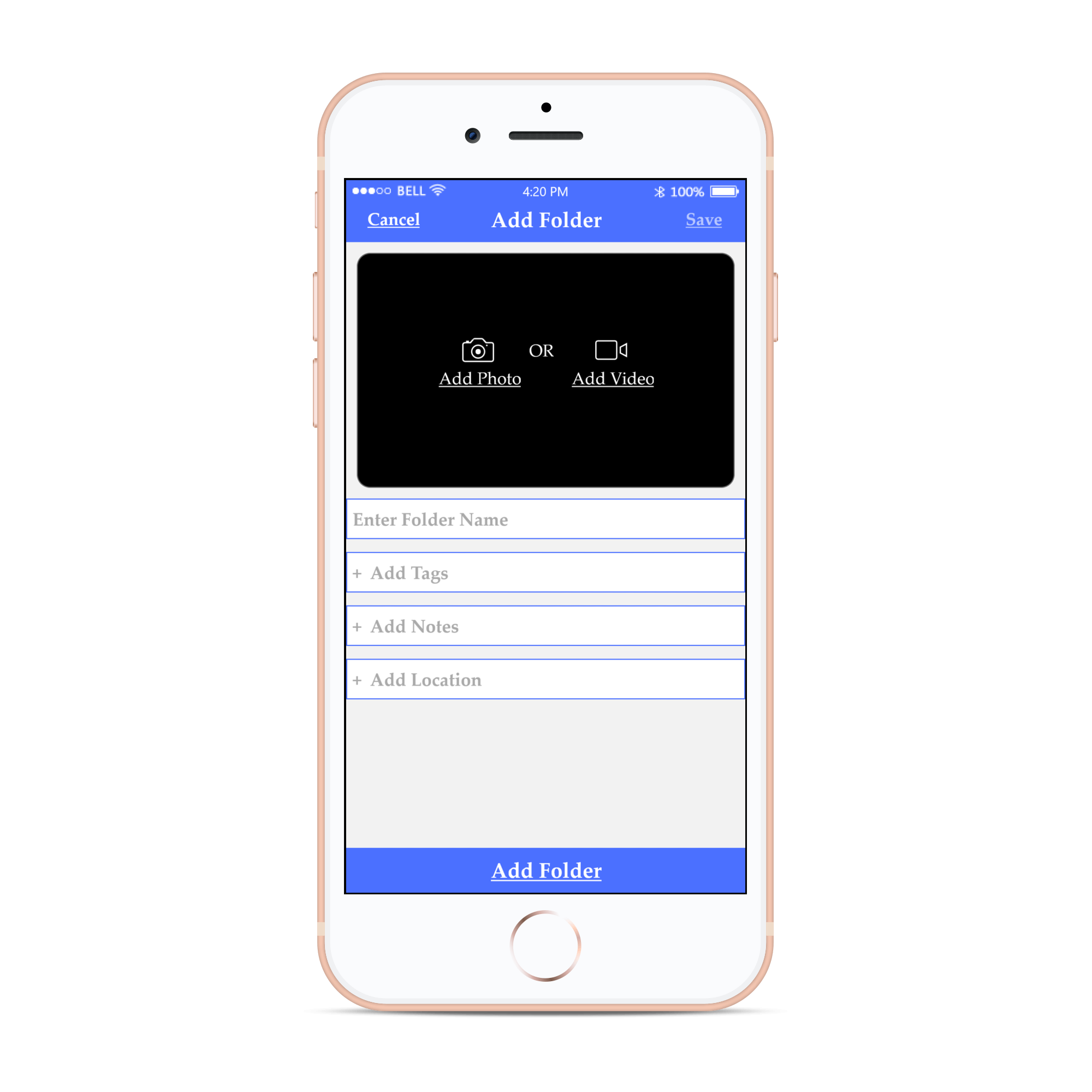
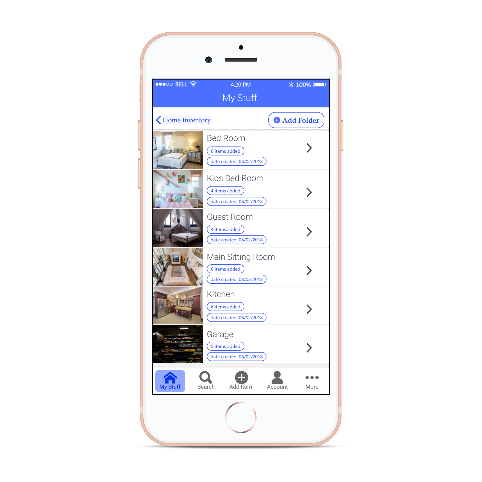
When it comes to finding things in the app, it is all about ease of navigation and time required to find your things. Categorizing and displaying the things meaningfully takes precedence in this case. We gave users the freedom to add, edit and arrange the folders/sub-folders as per their needs.
For "The Super casual"
Custom tags
The use of tags in inventory management is quite powerful when used correctly. Using custom tags, one can pull all items of certain types with one search and click. This feature save a ton of time when looking up for things of certain type. The users can simply give one tag or multiple tags to an item.
A feature that "Everyone" loves
Barcode Scanner
We've incorporated features that would save time for users who have a lot of inventory to maintain. We identified users with huge warehouse inventories, retail inventories, etc. that would benefit from this feature. A click on the barcode scanner would open the camera instantly and scan for the barcode data when the camera is in the correct position.
For anyone with "No Internet"
Offline Mode
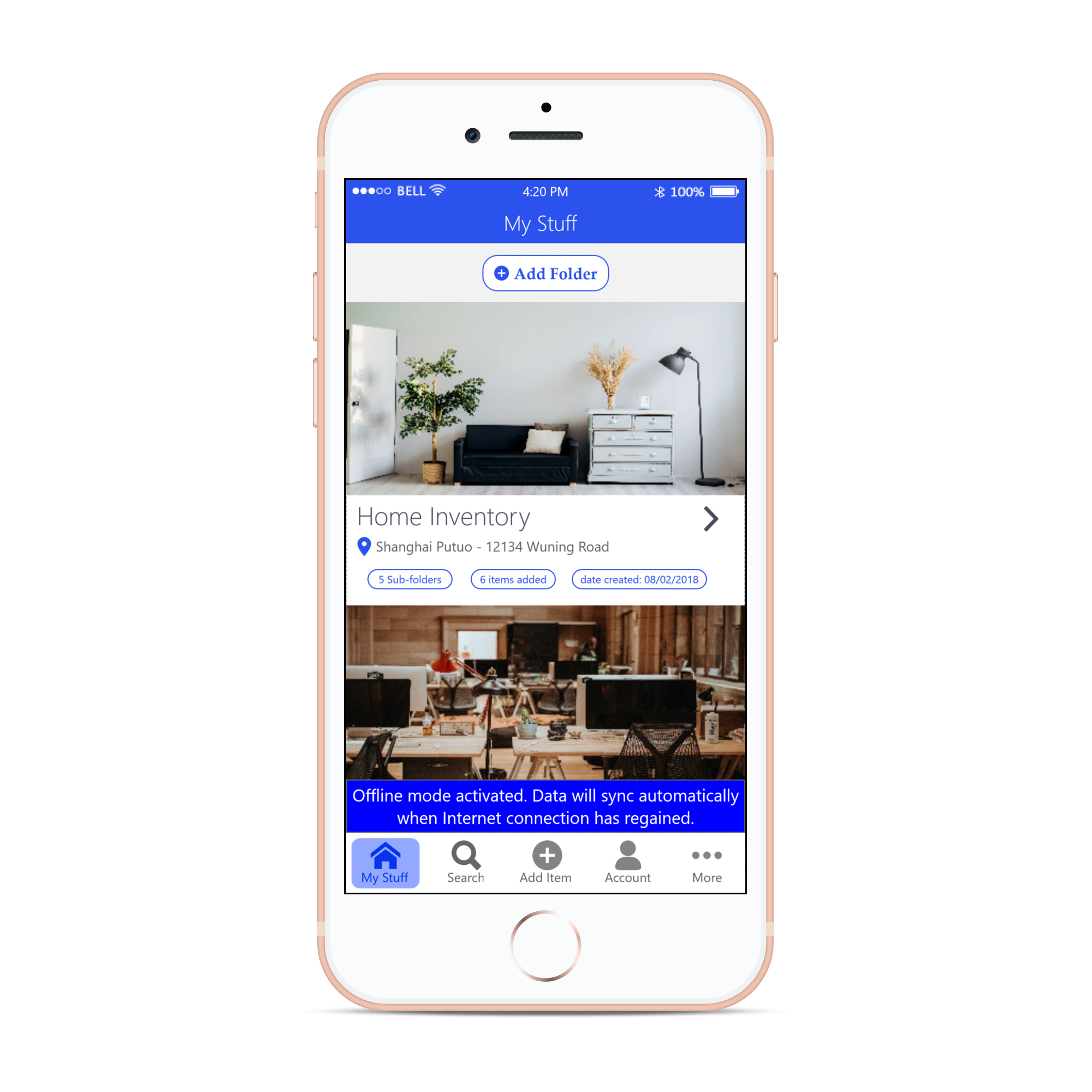
We understood how much of pain it is working in locations with no internet connectivity. This feature allows you to use the app and save all your data even when you have no internet connection. All the data is actively synced automatically when you gain internet connectivity. This is quite helpful to users working in warehouses or locations surrounded by multiple layers of concrete and inventory walls. The best thing is that it requires no user intervention, it activates automatically when it identifies that there is no internet connection :)
COGNITIVE WALKTHROUGH
We performed cognitive walkthrough in our first design iteration process by defining some tasks that the user will carry out during his interaction with the app. Below are few of the tasks that we assigned to the users:
- To sign up into Inventory App.
- To add an item into the folder by creating a tag.
- The process to record the item by narrating the details of it.
- The process to Scan Stock Keeping Unit or barcode for a product.
- To share a folder/details of the item with your closed one’s or insurance advisor by simultaneously exporting/importing the file.
Below are the questions that we compiled to identify the performance of the tasks:
- Will users be trying to produce the right outcome?
- Will users see the correct action they need to perform to produce the outcome?
- Will users recognize that this is the action they need to take to achieve the correct outcome?
- Will users understand the feedback?
HEURISTIC EVALUATION
To identify the problems associated with the designs of the user interface, we have decided to conduct Heuristic evaluation with our first design prototypes. We ranged the severity of the problems from levels 0 to 4, where 0 being the least severe and 4 being the highest severity.
Here is the detailed Heuristic evaluation report that we performed 👉 Heuristic Evaluation ReportSCREEN DESIGNS
Here are some of the screen mockups that we designed as part of the design process.
KEY LEARNINGS
No idea is a bad ideaDuring Brainstorming sessions effective communication of your idea is very important. The more ideas, the better features, the better design for your application.
Product InsightTo clearly know which feature to add or delete and to provide a better interaction to the user. This directly reduces the decision time for the user when more information is displayed.


